
Design decisions you can inspect.
A selection of identity, interface and launch work from Neutral Studio. The notes focus on what is visible in the published artefacts: the problem each system addresses, the design logic connecting its parts and how that logic can travel across formats.
What this selection proves
Neutral Studio works across brand identity, websites and digital products, but the underlying task is consistent: turn an idea into a set of decisions that other people can understand and use. The work below shows range in expression while keeping hierarchy, repeatability and implementation in view.
These are visual and process examples, not anonymous claims about commercial outcomes. Client testimonials, conversion figures and business results are published only when they can be attributed and used with permission. Where that evidence is not public, the page stays specific about the craft rather than inventing a success story.
The selection is also intentionally concrete about its limits. It does not imply that one image represents an entire engagement or that a visual system alone created a business result. Instead, each example points to choices a prospective client can evaluate directly: whether the hierarchy is clear, whether related touchpoints feel connected, whether the expression fits its context and whether the underlying idea can support more than one composition. Those are the qualities Neutral Studio can demonstrate from published material without asking a visitor to trust an unsupported number.
Additional process or implementation detail can be discussed when project permissions allow it.
Pocket Voice
The published work connects a compact voice-led identity with campaign compositions and a mobile product context. A reduced symbol, direct typography and a recognizable blue field create continuity across very different formats.
The useful design question is consistency: can the same idea remain legible as an app mark, a wordmark, a product screen and a campaign asset? The system shown here uses a small set of repeatable decisions instead of relying on a different visual trick for every placement.
VIRA
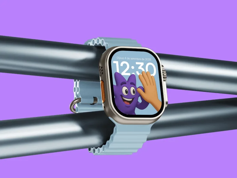
VIRA combines a soft flower-like symbol, a violet color world and a character-led wearable interface. The identity and interface are presented as parts of one experience rather than separate branding and product exercises.
On a watch, hierarchy and recognition have to survive a very small surface. The visual language therefore depends on clear silhouettes, controlled color contrast and a character that can communicate state without adding interface density. The same elements also give launch material a distinctive point of view.
Human Archive

Human Archive explores how an identity can organize memory, culture and collected material without becoming visually nostalgic. The selection pairs a restrained mark with an editorial application built around content and sequence.
Archive-oriented products need a strong framework but should not compete with the material they contain. The visible system uses typography, spacing and modular composition to provide structure while leaving room for different kinds of imagery and narrative. That balance is relevant to cultural platforms, knowledge products and content-rich digital services.
Circlehome
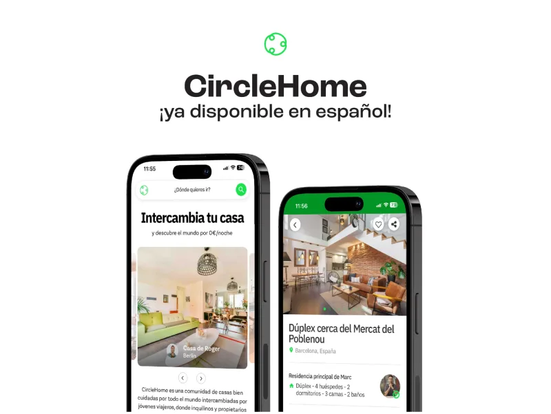
Circlehome turns a circular motif into a flexible identity and launch language. The shape can act as a mark, a frame and an organising device, helping product and marketing material feel related without forcing every composition to look identical.
The work demonstrates a practical principle behind design systems: useful repetition creates recognition, while controlled variation keeps the system alive. A launch set needs enough structure for a team to produce new assets quickly, plus enough range to support different messages, formats and levels of detail.
How the work is evaluated
Clarity before decoration
Each engagement starts by defining the audience, the decision the work must support and the environments where it will appear. A compelling visual direction is valuable, but it also has to explain the right thing, at the right moment, to the right person.
One logic across touchpoints
Identity, interface and marketing are tested together where the scope requires it. This exposes contradictions early: a mark that fails at app-icon size, a campaign language that cannot extend to product screens, or a website whose promise does not match the product experience.
A system another team can use
Final work is organized around reusable rules, production files and explicit behavior. The exact handoff depends on scope, but the standard is the same: the result should reduce future guesswork rather than make the studio a permanent bottleneck.
Choose the relevant next step
If the current problem is a fragmented identity, an unclear website, an interface that has grown through patches or an application that needs one connected design and development process, the service pages explain scope, deliverables and working method in detail.